Now Booking 2026–2027 Weddings | Free Decor Consultation
Transform Your Special Day | Professional Event Styling

Last spring, I walked into a venue consultation where a bride held a fabric swatch in the softest pistachio green paired with blush pink. She looked nervous, wondering if it was too bold. Fast forward to her wedding day, and that palette transformed the entire garden venue into something magical. Guests were still talking about its months later. I’m Zara Collins, a content writer at kdecor, and through countless wedding transformations I’ve witnessed, I’ve learned that the right colour palette doesn’t just decorate a space. It creates an atmosphere, tells your story, and becomes part of every treasured memory your guests take home.
Wedding colours for 2026 are embracing something beautifully unexpected. We’re seeing a season of contrasts where soft romantic neutrals sit alongside moody dramatic hues. Gone are the days when every wedding followed the same pastel playbook. Today’s couples want their celebrations to feel deeply personal and visually stunning.
This year brings us palettes that range from candlelit vintage ivory elegance to bold monochromatic blue luxury. Whether you’re planning an intimate garden ceremony or a grand ballroom celebration, these eight trending colour combinations offer endless possibilities for creating something truly unforgettable.
Your colour palette sets the tone for your entire celebration. It influences everything from your floral arrangements to your table settings, from the lighting design to the bridesmaid dresses. More importantly, it creates an emotional backdrop for one of the most meaningful days of your life.
The most successful weddings I’ve styled always started with a clear colour vision. When couples choose colours that genuinely resonate with their style and story, every other design decision falls into place naturally. The result feels cohesive, intentional, and authentically theirs.

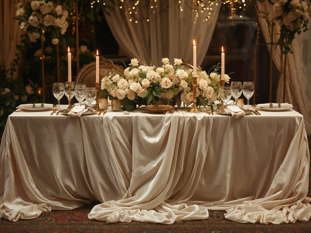
There’s something timelessly beautiful about a wedding bathed in shades of ivory and cream. This palette creates instant intimacy and warmth, especially when paired with the soft glow of candlelight.
Think layers of flowing fabric in varying ivory tones, from rich champagne to soft cream. Taper candles at different heights create dimension and romance, while touches of gold or brass add just enough sparkle without overwhelming the softness.
Perfect for: Evening ceremonies, barn venues, intimate gatherings, fall and winter celebrations
Styling elements to consider:
Flowing table runners in natural linen create texture and movement. Clusters of taper candles on vintage brass holders add height and drama to tablescapes. Neutral florals like garden roses, quicksand roses, and pampas grass bring organic softness. Draped ceiling installations in soft ivory fabrics transform any space into something ethereal. Gold rimmed glassware and flatware provide subtle elegance.
The beauty of this palette lies in its versatility. It works equally well in rustic barn settings and elegant ballrooms. The key is layering different shades and textures to prevent the space from feeling flat or one dimensional.
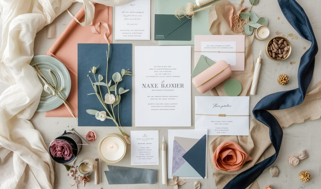
The combination of soft blush pink with muted pistachio green feels fresh, feminine, and surprisingly sophisticated. This palette draws inspiration from botanical gardens and brings the outdoors beautifully inside.
What makes this pairing so special is the balance it strikes. The pink adds romance and softness while the green grounds everything with natural, earthy tones. Together, they create a palette that feels both modern and timeless.
Perfect for: Spring and summer weddings, garden venues, outdoor ceremonies, daytime celebrations
Styling elements to consider:
Anthurium or calla lily arrangements showcase both colours naturally. Flowing silk ribbons in coordinating shades add movement to bouquets and installations. Mixed greenery walls or hanging installations create stunning backdrops. Soft pink linens paired with sage green napkins bring the palette to table settings. White or cream candles keep everything feeling light and airy.
I’ve found this palette works beautifully when you let one colour dominate. Use green as your primary with pink accents for a more botanical feel or reverse it for something more romantic. The Pantone color cards from 2026 showcase this combination perfectly, proving it’s not just pretty but also on trend.
For couples wanting drama and sophistication, monochromatic deep blue delivers in every way. This palette ranges from rich royal blue to midnight navy, creating depth through varying shades of a single colour family.
The moody, luxurious feeling this creates is unmatched. It’s bold without being overwhelming, elegant, and without feeling stuffy. When executed well, a deep blue wedding feels like stepping into a jewel box.
Perfect for: Evening receptions, luxury ballrooms, winter weddings, formal celebrations
Styling elements to consider:
Velvet linens in varying blue tones create incredible texture and richness. Ornate baroque style backdrops or vintage doors painted in deep blue make stunning photo moments. Crystal or silver accents catch the light beautifully against dark blue. Deep blue florals like delphiniums and hydrangeas reinforce the monochromatic theme. Metallic touches in silver or gold prevent space from feeling too dark.
Lighting becomes especially important with this palette. Amber uplighting warms the blue tones and adds dimension to the space. Consider string lights or chandeliers to break up the darkness and create pools of warm light throughout your venue.
This palette embraces maximalist beauty through a collection of rich jewel tones. Think chocolate brown, deep burgundy, emerald, green, olive, and burnt orange all working together in luxurious harmony.
It’s a bold choice that pays off spectacularly. While some palettes whisper, this one makes a statement. The key is to use these colours in varying proportions rather than equal amounts.
Perfect for: Fall weddings, indoor venues, evening celebrations, couples who love bold design
Styling elements to consider:
Cascading fabric installations in multiple jewel tones create dramatic focal points. Mixed jewel tone florals in burgundy dahlias, chocolate cosmos, and deep orange roses look incredibly lush. Gold or copper metallic accents warm up the rich tones beautifully. Layered table settings with different coloured napkins, chargers, and glassware embrace the maximalist approach. Dark wood elements ground all the rich colours.
This palette tells guests you’re not afraid of colour or drama. It works especially well in venues with high ceilings and architectural details that can handle the visual weight of these rich tones.
Choosing your perfect palette is exciting, but executing it flawlessly requires expertise and attention to detail. This is where professional styling makes all the difference between a good wedding and an unforgettable one.
Kdecor specializes in transforming trending colour concepts into breathtaking reality. From vintage ivory candlelit installations to dramatic monochromatic blue setups, the team understands how to layer textures, lighting, and design elements that make each palette truly memorable.
Whether you’re drawn to the soft romance of pink pistachio or the bold luxury of jewel tones, kdecor provides custom wedding decor packages that bring professional precision to your colour vision. The designers stay ahead of trends while ensuring every element feels authentically personal to each couple.
Working with experienced decorators means your colours will look cohesive across every element, from ceremony to reception. They understand how different fabrics catch light, which florals work in each season, and how to create depth and dimension within your chosen palette.
Sage and Terracotta: Earthy Bohemian
The combination of muted sage green with warm terracotta creates an organic, grounded feeling. This palette works beautifully for outdoor celebrations, desert weddings, or rustic venues. Dried florals, macrame details, and natural wood elements complete the bohemian aesthetic. It feels effortlessly cool and deeply connected to nature.
Lavender and Cream: Soft Dreamy Romance
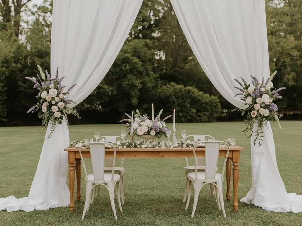
Soft lavender paired with ivory cream creates the most romantic, whimsical atmosphere. This palette feels like a garden at dawn, fresh, and delicate. Fresh lavender bundles, white garden roses, and flowing fabrics in cream make this combination sing. It’s perfect for spring and summer celebrations, especially in garden settings or venues with lots of natural light.
Rust and Dusty Blue: Vintage Modern
Rust orange meets dusty blue for a palette that feels both vintage and contemporary. This unexpected combination works beautifully in fall or in industrial and barn venues. Mixed metals, vintage furniture pieces, and a blend of wild and structured florals complete the look. It’s sophisticated without taking it too seriously.
Black and Gold: Modern Glamour
For ultimate sophistication, matte black paired with metallic gold creates instant glamour. This palette works exceptionally well for evening receptions in modern venues. Geometric designs, sleek lines, and strategic metallic accents make everything feel polished and intentional. It’s bold, confident, and undeniably chic.

The most cohesive weddings carry their colour palette through every touchpoint. This doesn’t mean everything matches exactly, but rather that there’s a clear visual thread connecting each element.
Start with your venue: Look at its existing colours and architectural style. Your palette should complement space rather than fight against it. A rustic barn with warm wood tones naturally suits jewel tones or vintage ivory. A modern industrial space with concrete and metal works beautifully with bold contrasts like black and gold or deep blue.
Consider the season: Certain colours naturally feel more appropriate at different times of year. Warm, rich tones suit fall and winter celebrations while fresh, lighter colours shine in spring and summer. That said, any palette can work in any season with the right styling approach.
Think about lighting: Natural daylight shows colours differently than evening candlelight or uplighting. If you’re having an evening wedding, test how your colours look under warm artificial light. Some colours that seem vibrant in daylight can appear muddy or dark at night.
Coordinate your florals carefully: Work with your florist to find flowers that naturally occur in your chosen colours. While anything can be dyed, blooms in their natural colours always look more beautiful and authentic. Seasonal availability also affects your options, so have this conversation early.
Extend to your stationery: Your invitations set expectations for your wedding style. Carry your colour palette through saving the dates, invitations, programs, menus, and signage. This creates anticipation and helps guests understand your aesthetic vision before they arrive.
Consider your bridal party: Bridesmaid dresses and groomsmen attire should work within your palette without necessarily matching exactly. Varying shades within the same colour family often looks more sophisticated than identical matching.
I’ve seen beautiful colour palettes fall flat because of poor execution, and I’ve seen simple palettes elevated to extraordinary through skilled styling. The difference always comes down to understanding how colours interact with light, texture, space, and each other.
Professional decorators bring technical knowledge that makes your vision work. They know which fabrics drape beautifully and which look stiff. They understand how to create focal points that draw the eye and how to use colour to guide guests through your celebration.
They also handle the logistics that couples often underestimate. Coordinating delivery times, managing setup crews, troubleshooting last minute challenges, and ensuring everything looks perfect before guests arrive requires experience and systems.
Explore kdecor’s social platforms to see how trending designs transform real weddings into dreamy celebrations. The portfolio showcases how each colour palette comes to life through thoughtful styling, attention to detail, and creative execution. From intimate ceremonies to grand receptions, you’ll find inspiration for making your own colour vision reality.
Choosing your wedding colours is one of the most personal and exciting decisions in your planning journey. The 2026 trends we’ve explored, from romantic vintage ivory to dramatic deep blue, offer beautiful inspiration. But remember, the best palette is the one that genuinely reflects your style and vision.
Whether you’re drawn to the soft elegance of pink pistachio, the moody luxury of monochromatic blue, or the bold richness of jewel tones, commit to colours that make your heart happy. Work with experienced professionals who can bring your vision to life with precision and creativity.
You’re wedding colours set the emotional tone for your entire celebration. They appear in every photograph, influence every design choice, and become woven into the memories your guests carry home. Choose thoughtfully, style intentionally, and trust that the right palette will transform your venue into something truly unforgettable.
Ready to bring your colour vision to life? Let your dream wedding palette tell your unique love story.

Zara Collins brings 6+ years of content writing expertise to every project, specializing in lifestyle and creative content that resonates with modern audiences. Her work focuses on creating authentic, reader-friendly content that performs well in search engines while building genuine connections with readers.