
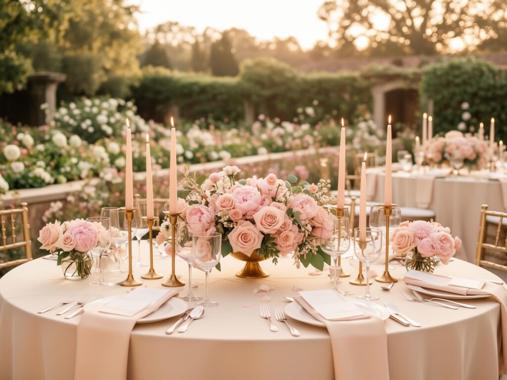
Couples booking 2027 dates start asking me about the 2027 wedding colour trends before they have even finalised the guest list. Fair enough. The colour decision shapes everything that follows it, and once you have committed to it in your florals, your linens and your bridesmaid dresses, changing your mind gets expensive.
So here is what I am seeing come through, six wedding colour palettes for 2027 that keep landing on my desk, and more usefully, how each one behaves once it goes into a real room. A palette that sings on a mood board can fall completely flat in a banquet hall with beige walls, and that gap is where most disappointment lives.
Everything below comes from setups we have actually built at K-Decor Studio Inc. through our wedding decor services in Windsor, not from a trend report. Every photograph on this page is our own work in a local room, because a palette only proves itself once it is standing up in one.
Palettes are getting deeper and less matched. If you read nothing else about 2027 wedding colour trends, read that line.
For years couples picked two colours and held them rigidly across every element. That has loosened. The 2027 direction layers several tones in the same family, keeps one element deliberately light so the richness does not turn heavy, and lets things sit next to each other without matching exactly.
The other shift is metal. Gold has run the show for the better part of a decade and silver is coming back, which changes chargers, candle vessels, cutlery and frames all at once. More on that further down, because it matters more than people realise.
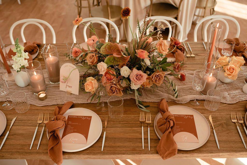
Warm, glowing, and the most forgiving palette on this list under artificial light.
Amber sits between rust and burnt orange, and it does something no cool colour can do in a banquet room. It picks up candlelight and warm uplighting and it flatters everyone in the photographs. Pair it with cream or ivory rather than white, which goes slightly blue next to it, and keep the greenery muted.
Where it struggles is daylight. In a bright room with big windows, amber can read a little heavy by mid afternoon. Save it for evening receptions and autumn dates, and let the lighting do half the work.
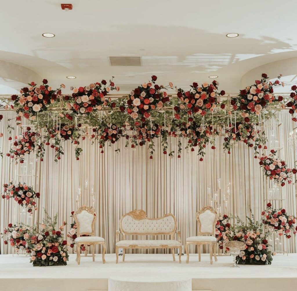
Rich, confident, and the palette that photographs best in a dark room.
Berry covers mulberry, deep raspberry and the softer edge of burgundy. It is a step away from the wine reds everyone used through 2024 and 2025, brighter without tipping into primary red. Put it against cream, blush or even a soft grey and it reads modern rather than traditional.
The mistake I see is going berry on everything. Florals, linens, napkins, bridesmaid dresses and draping in the same deep tone turns a room into a cave. Keep something light in the setup, a bare wood table, a cream linen, fresh green foliage, and the depth suddenly reads as elevated instead of oppressive.
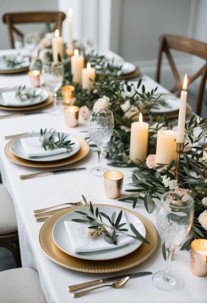
The single most consistent colour across every 2027 palette, and the easiest one to say yes to.
Green does something the others cannot. It works in every season, it costs less than the equivalent volume of blooms, and it holds up through a long day without wilting into something sad by the speeches. Foliage runners down long tables, greenery walls behind a head table, olive and eucalyptus mixed through centrepieces.
It also solves a problem specific to our venues. Most halls across Windsor and Essex County give you warm beige walls and brown carpet, and green is the one colour that lifts that rather than blending into it. If you want to see how it plays across different table shapes, our wedding centrepiece ideas covers the arrangements that work.
If you are undecided and running out of time, pick green. You will not regret it.
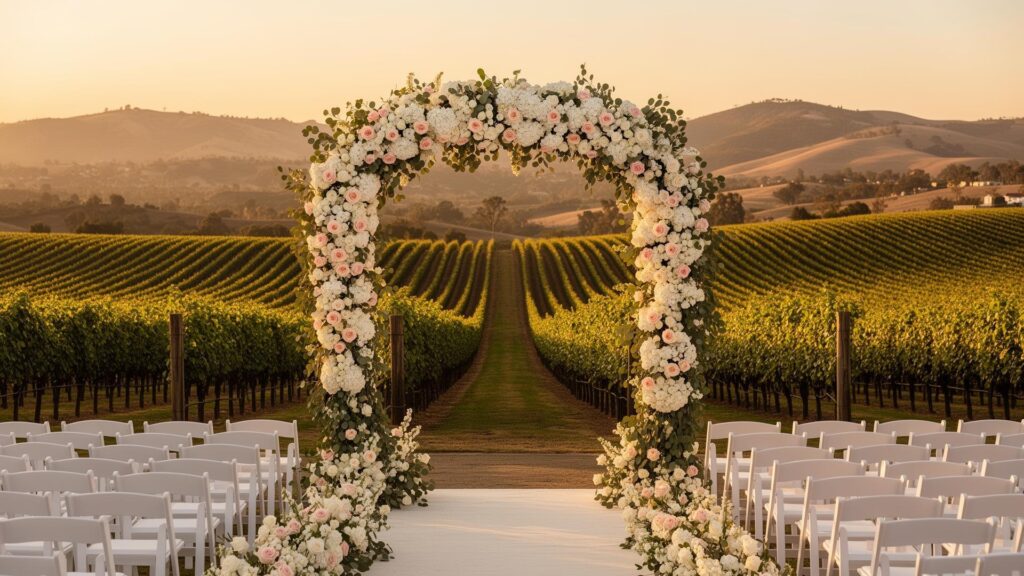
Blended warm tones, and the palette I would push you towards for an outdoor ceremony.
Sunset means several warm shades layered rather than one, so amber into coral into soft pink into gold. Nothing matches exactly, which is the point, and it suits the looser 2027 approach better than any other direction here.
It works beautifully outdoors because it echoes what is already happening around you at a late afternoon ceremony. Indoors it needs warm lighting to hold together, otherwise the pinks and the oranges start fighting each other under a ceiling grid. Our fall wedding decor ideas for Windsor venues covers the lighting side in more detail, and it applies directly here.
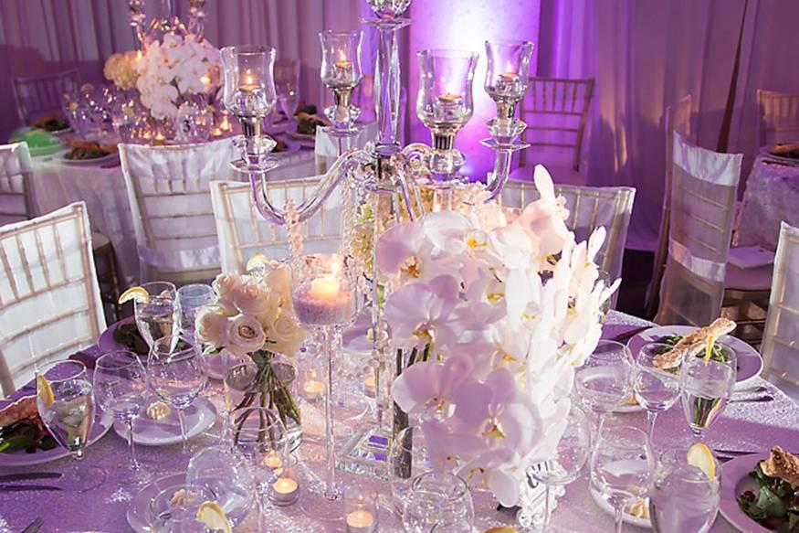
Purple toned, quietly dramatic, and more flexible than couples expect.
Orchid spans mauve, dusty lilac and deeper plum. It reads romantic at the soft end and formal at the deep end, which means you can run pale orchid for a garden ceremony and take it deeper for the reception without changing palette. Silver suits it better than gold, and so does soft grey.
We built a version of this in a mauve reception we styled in Windsor, and the thing that made it work was restraint in the greenery. Orchid against heavy dark foliage goes muddy. Against pale eucalyptus it stays clean.
Soft, classic, and doing far better than “pale pink” suggests.
Petal pink is a light blush with warmth in it rather than the cool baby pink that dated so quickly. It photographs beautifully, it suits daytime and evening equally, and it works in rooms where a deeper palette would feel too much.
The trick is texture. Pink on flat surfaces looks thin. Pink across crushed satin, velvet runners, layered florals and draped fabric looks expensive. You can see how fabric carries a soft palette in our champagne draping reception, where the fabric did most of the work and the florals just accented it.
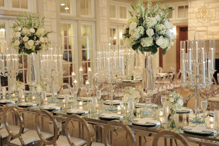
After years of gold everything, silver is back, and it changes more of your setup than the palette itself does.
Chargers, candle vessels, cutlery, frames, easels, the trim on your stationery. Switch metal and all of it switches with you, so decide early rather than halfway through. Silver reads cooler and slightly more formal, and it sits naturally with orchid, berry and petal pink. Against amber and sunset palettes it fights a little, so those stay with gold or brass.
If you are renting, check what metal the supplier stocks before you commit a palette to it. The draping, linens and backdrops we rent come in both, but not every item exists in both finishes, and that is worth knowing at the planning stage instead of three weeks out.
Start with the room, not the mood board. That order saves couples more disappointment than any other advice I give.
Walk your venue and note three things. What colour are the walls, what is on the floor, and how much natural light comes in. Beige walls need contrast, which rules against the softest neutrals. Patterned carpet fights busy palettes, so keep the tables cleaner. A room with big windows and an afternoon ceremony handles pastels far better than a windowless hall does.
Then check your palette against the lighting you will actually have. Almost every banquet room around Windsor lights evenly and coolly from the ceiling, and that flattens colour. Warm uplighting fixes it, and it is the single change that makes the most difference to how your palette photographs.
Amber orange, berry red, verdant green, sunset hues, orchid and petal pink are the six directions coming through most consistently. The broader shift is towards layered palettes that do not match exactly, with silver returning as the preferred metallic.
Green appears in more 2027 palettes than any other colour. It suits every season, works in almost any venue, and costs less than the equivalent volume of flowers.
Silver works best with orchid, berry and petal pink. Gold and brass still suit amber and sunset palettes. Pick the metal early, since it affects chargers, vessels, cutlery and frames all at once.
Start with your venue rather than a mood board. Check the wall colour, the flooring and the natural light, then test your palette against the lighting you will actually have on the day.

Zara Collins brings 6+ years of content writing expertise to every project, specializing in lifestyle and creative content that resonates with modern audiences. Her work focuses on creating authentic, reader-friendly content that performs well in search engines while building genuine connections with readers.